deepening your photography skills
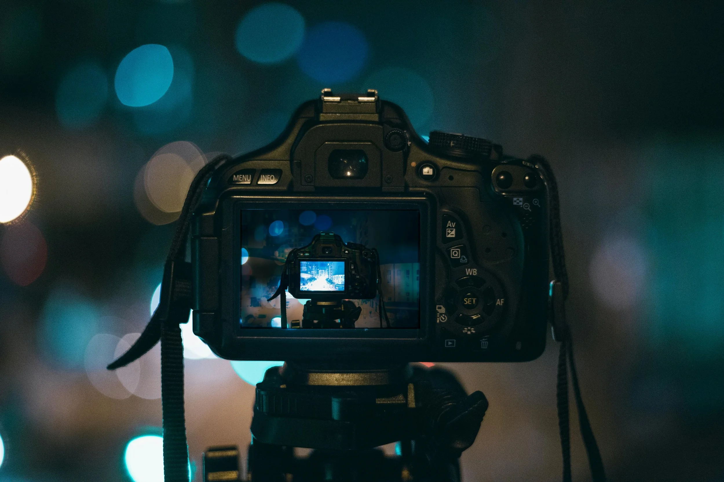
MASTERING AVAILABLE LIGHT
-
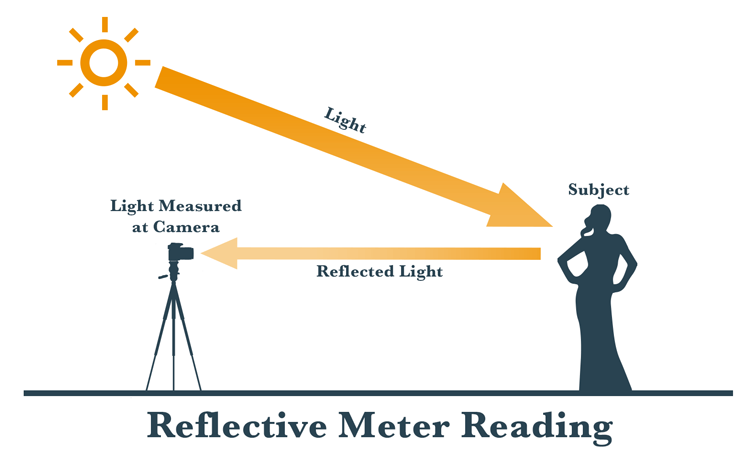
Reflective metering:
Measures the amount of light hitting the subject and bouncing back to the meter (which in many cases will be in your camera).
It is affected by the color or brightness of the subject itself.
If the subject is dark, less light bounces back to the meter. With a light colored subject (white shirt) more light is bounced back to be measured.
This presents a problem because it doesn’t always give an accurate reading of the amount of light.
The following scenarios may fool your in-camera meter:
A light colored subject
A dark toned subject
A backlit subject (light is behind them)
An overly bright background or high contrast in the scene
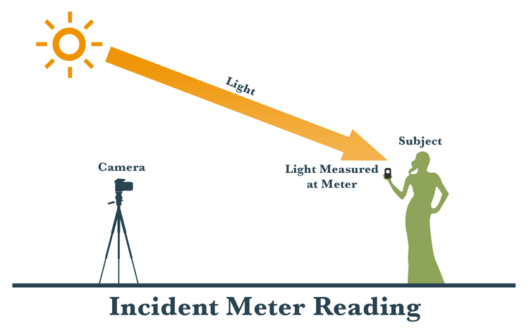
Incident metering:
This is where you use a handheld light meter to measure the amount of light falling on the subject.
It is not affected by the brightness or tonality of the subject and will give you a more accurate reading right off the bat.
Incident metering is done by placing the meter by the subject, pointing it at the light source and taking a reading.
The meter will tell you what settings to use on your camera to get a good exposure.
You plug the ISO in, and the meter tells you the shutter speed/aperture combination to use. You can also scroll up and down to see different pairings – for example:
-
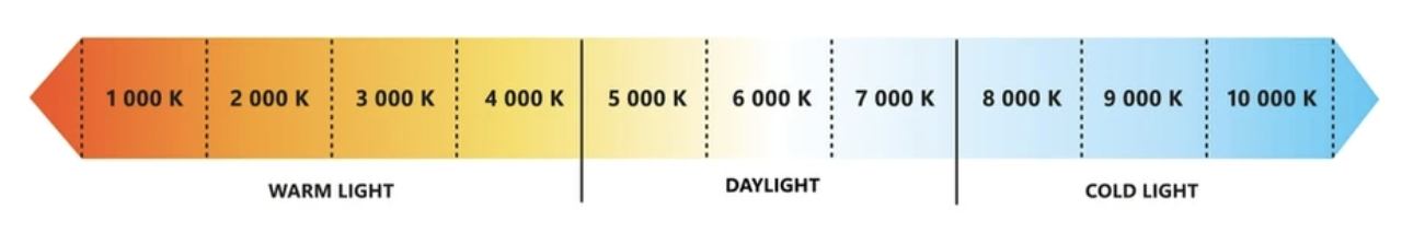
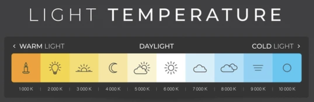
Color Temperature:
Color temperature is a way to describe the color of light, with lower temperatures (e.g., 2700K) appearing warmer (more reddish/orange) and higher temperatures (e.g., 6000K) appearing cooler (more bluish).
For example, candlelight is very warm (around 1900K), while a cloudy sky is cool (around 7500K).
Common light sources and their approximate color temperatures include:
Candlelight: 1900K
Tungsten light (incandescent): 2700-3200K
Sunrise/Sunset: 2800-3000K
Fluorescent light: 4000-5000K
Daylight: 5000-6500K
Cloudy sky: 6000-7500K
Shade: 7000-10000K
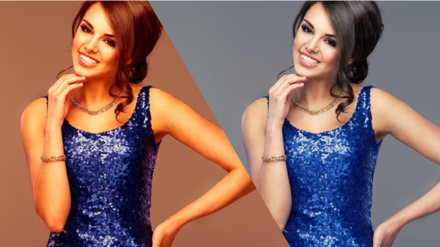
White Balance:
The process of adjusting colors in an image to make white objects appear white, rather than tinted with another color due to the light source.
It's achieved by manipulating the color temperature.
Measured in Kelvins (K) which represent the amount of warmth of coolness a color gives off.
Different light sources emit light with varying color temperatures, and white balance settings help cameras compensate for these differences to produce accurate colors.
-
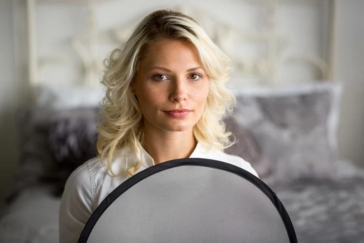
Gray Card Readings:
Typically 18% gray, is used in photography to achieve accurate color balance and consistent exposure.
It acts as a reference point for both white balance and exposure metering, ensuring that colors appear natural and tones are accurately captured.
1. Accurate White Balance:
Gray cards help eliminate color casts caused by different light sources (like tungsten or fluorescent) or by the environment itself.
By capturing an image of the gray card under specific lighting conditions, photographers can later set a custom white balance in post-processing, ensuring accurate color reproduction in all subsequent shots taken under the same lighting.
This is particularly useful when dealing with mixed lighting or when the camera's auto white balance struggles to accurately interpret the color temperature.
2. Consistent Exposure:
Gray cards help photographers achieve consistent exposures, especially when dealing with challenging lighting situations (e.g., subjects against a bright background).
The 18% gray value is a middle ground, and using a gray card allows photographers to meter the light and ensure that the camera's meter is calibrated to this middle gray, which provides a good starting point for exposure.
By metering off the gray card, photographers can avoid over or under-exposing their images.
3. Neutral Reference Point:
Gray is a neutral tone, lacking any color bias. This makes it an ideal reference point for both exposure and white balance adjustments.
A gray card provides a consistent and reliable reference point, unlike relying on the colors of objects in the scene, which can vary widely.
In essence, a gray card helps photographers take the guesswork out of color balance and exposure, leading to more accurate and consistent results, especially in challenging or inconsistent lighting conditions.
-
Exposure Compensation:
is a photography setting that allows you to adjust the brightness of your image, overriding the camera’s exposure settings.
It's particularly useful in challenging lighting situations where the camera's meter might misinterpret the scene.
By using exposure compensation, you can make your photos brighter or darker than what the camera suggests, allowing for more creative control.
How it works:
Overriding Automatic Exposure:
Exposure compensation lets you manually adjust the exposure settings to achieve your desired brightness level.
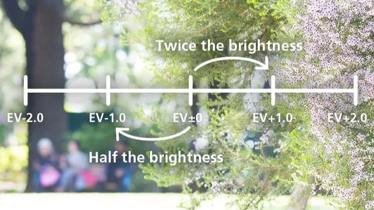
EV Units:
Exposure compensation is measured in EV (Exposure Value) units. A +1 EV value means one stop brighter, while -1 EV means one stop darker.
Finding the Setting:
Most cameras have a dedicated dial or button for exposure compensation, often labeled with a +/- symbol.
When to use exposure compensation:
Bright Scenes:
In situations with a lot of white (snow, sand, bright sky), the camera might underexpose, making the scene appear darker. You'd use positive exposure compensation to brighten it up.
Dark Scenes:
Conversely, in dark scenes, the camera might overexpose. Negative compensation can help darken the image and restore detail.
High Contrast:
When there's a large difference in brightness between the subject and the background, the camera's meter might struggle to find the right balance. Exposure compensation can help you expose your subject correctly.
Creative Control:
Exposure compensation can also be used to create specific effects, like making a subject stand out against a dark background or adding a dramatic feel to a scene.
Examples:
Shooting in the snow:
The camera might underexpose, making the snow look gray. Use positive exposure compensation (+2 to +3 stops) to get a bright, white snow scene.
Shooting a sunset:
The camera might overexpose the sky, losing the vibrant colors. Use negative exposure compensation (-1 stop or more) to darken the scene and preserve the colors.
Shooting a backlit subject:
If your subject is dark against a bright background, use positive exposure compensation to brighten the subject.
In essence, exposure compensation empowers you to take control of your camera's exposure and achieve the exact look you envisioned for your photos.
-
Contrast:
The difference in brightness and color between different parts of an images.
It's the variation in tones, from the lightest highlights to the darkest shadows, that makes an image visually interesting and impactful.
Here's a more detailed explanation:
Types of Contrast:
Tonal Contrast:
This is the most common type, referring to the difference between light and dark areas in an image.
High tonal contrast means a wide range of tones, with bright highlights and deep shadows, while low tonal contrast has a narrow range of tones, often making the image appear flat.
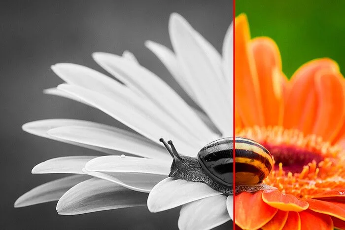
Color Contrast:
This refers to the difference between colors in an image.
Complementary colors (opposite each other on the color wheel, like red and green) create high color contrast, while similar colors (like different shades of green) create low color contrast.
Texture Contrast:
This involves the visual difference between smooth and rough textures in an image.
Shape and Subject Contrast:
This refers to the difference in shapes and subjects within an image, such as a sharp-edged object against a soft background.
Why is contrast important?
Visual Impact:
Contrast can make an image more engaging and draw the viewer's eye.
Depth and Dimension:
High contrast can create a sense of depth and dimension, making the subject appear more three-dimensional.
Mood and Atmosphere:
Contrast can be used to convey different moods and atmospheres, from dramatic and dynamic with high contrast to calm and serene with low contrast.
Emphasis:
Contrast can be used to highlight a subject or specific details in an image.
How to use contrast:
High Contrast:
Use strong light sources, like direct sunlight, to create deep shadows and bright highlights. This can be effective for creating dramatic and impactful images.
Low Contrast:
Use soft, diffused light, like an overcast day, to create a more subtle and muted look. This can be good for creating a sense of calm or mystery.
Editing:
Editing software like Adobe Lightroom allows you to adjust the contrast in your images, giving you more control over the final look and feel.
-
Focus: Mastering available light
Goal: Shoot 5 images for each different lighting condition:
Window light
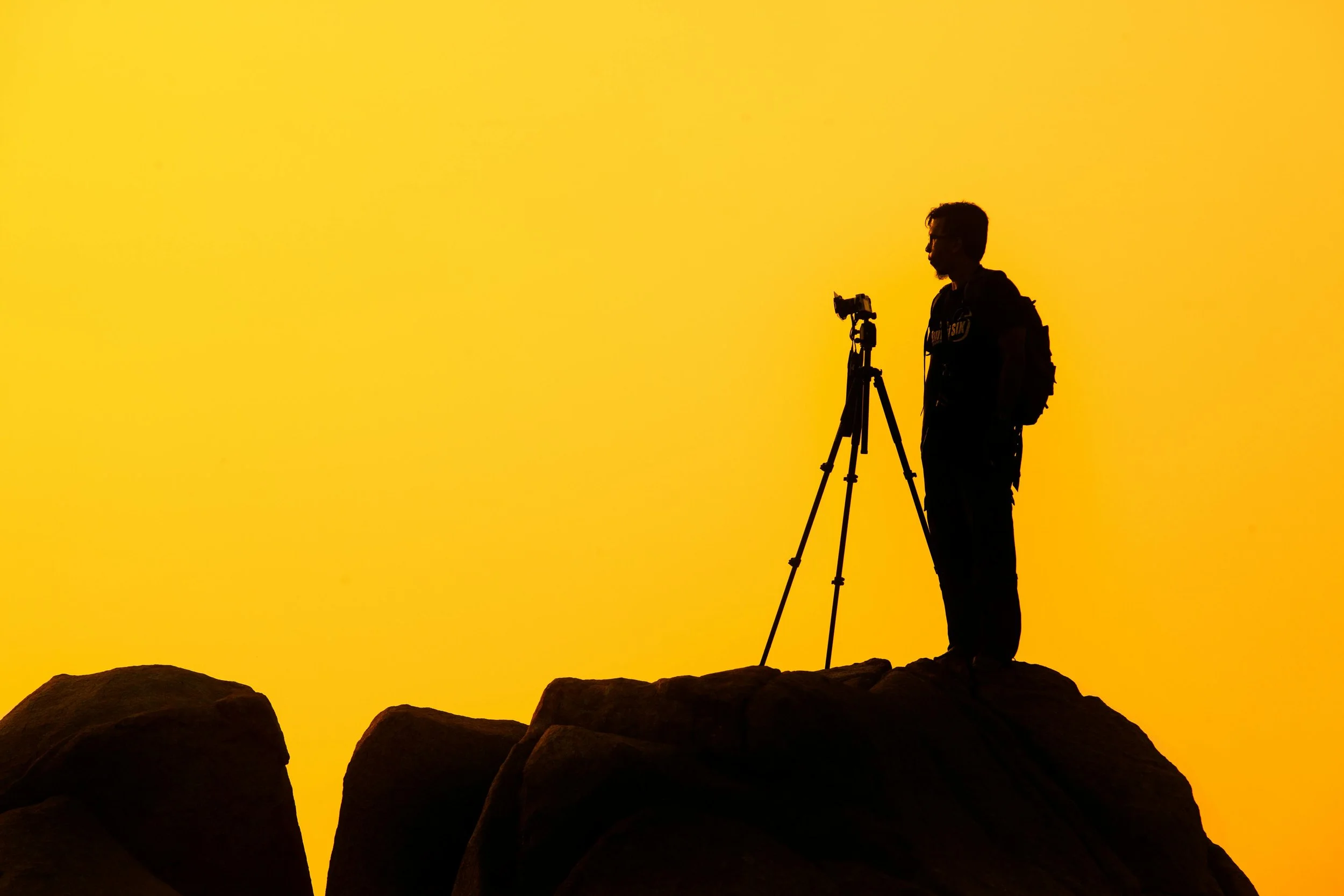
Backlight/silhouette
Harsh midday sun
Overcast/diffused light
Golden hour
Nighttime with artificial light
Consider your composition, exposures and white balance for each image.
Skills Built: Light control, exposure, white balance, mood creation
REFLECTIVE VS INCIDENT LIGHT METER READING
COLOR TEMPERATURE + WHITE BALANCE
WHITE BALANCE

COOL VS WARM
GRAY CARD METERING FOR WHITE BALANCE + EXPOSURE
EXPOSURE COMPENSATION
WHAT IS CONTRAST?
NARRATIVE STORYTELLING
-
Focus: Narrative and sequencing
Goal: Tell a complete visual story in just 5 images. Must include:
Establishing shot (context)
Medium/detail shot
Action or interaction shot
Emotion/portrait shot
Closing image or resolution shot
Topics to explore: A local business, a family ritual, morning routine, a street scene
Skills Built: Visual storytelling, variety in framing, editorial thinking, emotional timing
-
Embrace Visual Thinking
Understand the Power of Composition
Visualize with Intention
Harness the Power of Symbolism
Create Visual Contrasts
-
Embrace Visual Thinking
To become a better photographer, look for fascinating visual elements in your environment.
Train yourself to spot creative details, unique compositions, and interesting light and shadow interactions. This way of thinking will help turn the world around you into a canvas to tell stories on.
-
Understand the Power of Composition
To ensure your audience understands and feels the story you're trying to convey, it's essential to learn the principles of composition, such as the rule of thirds, leading lines, and balance.
These principles allow you to arrange the elements in your frame effectively.
Experiment with different composition techniques to create the desired emotional impact.
Remember that every visual choice you make should contribute to the story and help enhance its meaning.
-
Visualize with Intention
Having a strong visualization of the final product is vital for any photographer or filmmaker.
Try to imagine the shots, sequences, and transitions in your mind even before you start shooting.
This will help you plan your storytelling approach better and effectively convey your vision to your team.
-
Harness the Power of Symbolism
To enhance the narrative of your story, strategically use symbols that are consistent and relevant to the themes or characters.
By using symbolism effectively, you can convey deeper meaning and emotions to your audience, engaging them subconsciously.
-
Create Visual Contrasts
Using contrasts is a powerful way to enhance your visual storytelling.
You can achieve contrast by contrasting light and dark, color and monochrome, wide shots and close-ups, or fast and slow motion shots.
Contrasting elements help to draw attention to important aspects of your story, build anticipation, and evoke different emotions.
You can experiment using contrasts to add more depth and complexity to your storytelling.
ONE LENS, ONE WEEK
-
Focus: Creativity under constraints
Goal: Choose one fixed focal length (prime lens or locked zoom) and shoot exclusively with it for a full week.
Challenge Add-ons:
No cropping in post
No filters or presets
All photos in black & white
Skills Built: Composition, subject proximity, decisive framing, intention in-camera
COLOR HUNT PROJECT
-
Focus: Visual consistency and style
Goal: Pick two colors (e.g., red, teal, yellow) and photograph everything you can find in those colors for 3 days. Aim for 10–15 final selects per color.
Final Task: Create a unified color grid collage with complementing hues.
Skills Built: Color theory, consistency in editing, visual pattern recognition, abstraction
Congratulations on completing the Deepening Your Photography Skills course.